Case study 02 / 2026
Brand strategy and identity for a cross-border payments platform serving individuals and businesses across Africa.
- Year
- 2026
- Role
- Brand designer
- Sector
- Fintech, cross-border payments
- Delivered
- Brand strategy, Logo, Colour and type, Brand voice, Illustration style, Applications
01 / Overview
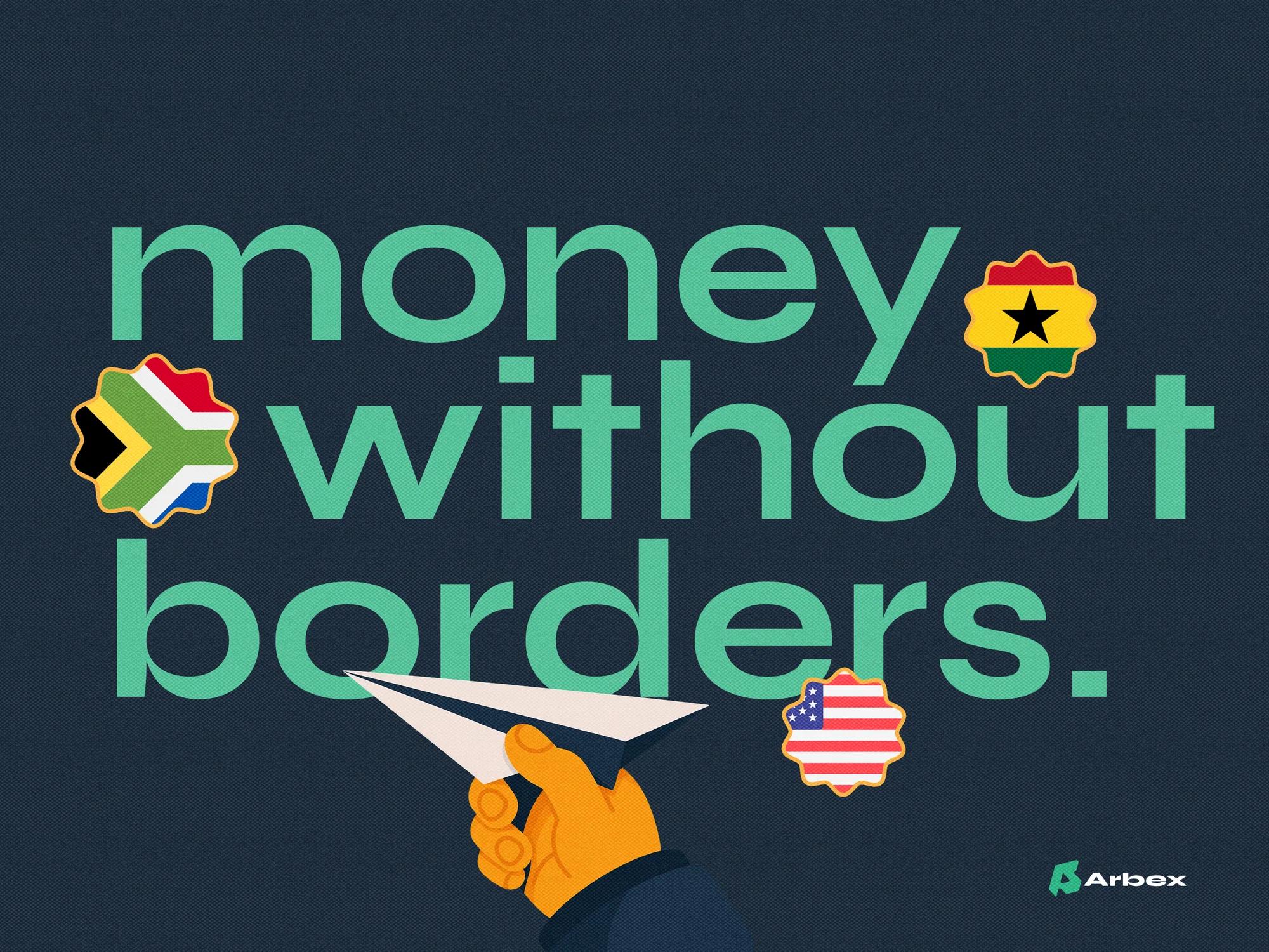
Arbex is a cross-border payments platform for individuals and businesses across Africa. It lets people send, receive, exchange and grow money without the friction, fees and limits they have been told to accept.
The scope was the full identity: positioning and brand voice first, then the logo, colour, typography, illustration and the applications that carry them.
02 / The problem
For too long, the financial system treated Africa as an afterthought: slower transfers, higher fees and less access for the people who need it most.
Visually, the category falls back on two defaults: the formality of a traditional bank, or the interchangeable look of a global fintech app. Arbex needed to earn trust without feeling distant, and to feel rooted in Africa without looking small.
03 / Approach
01
A confident voice
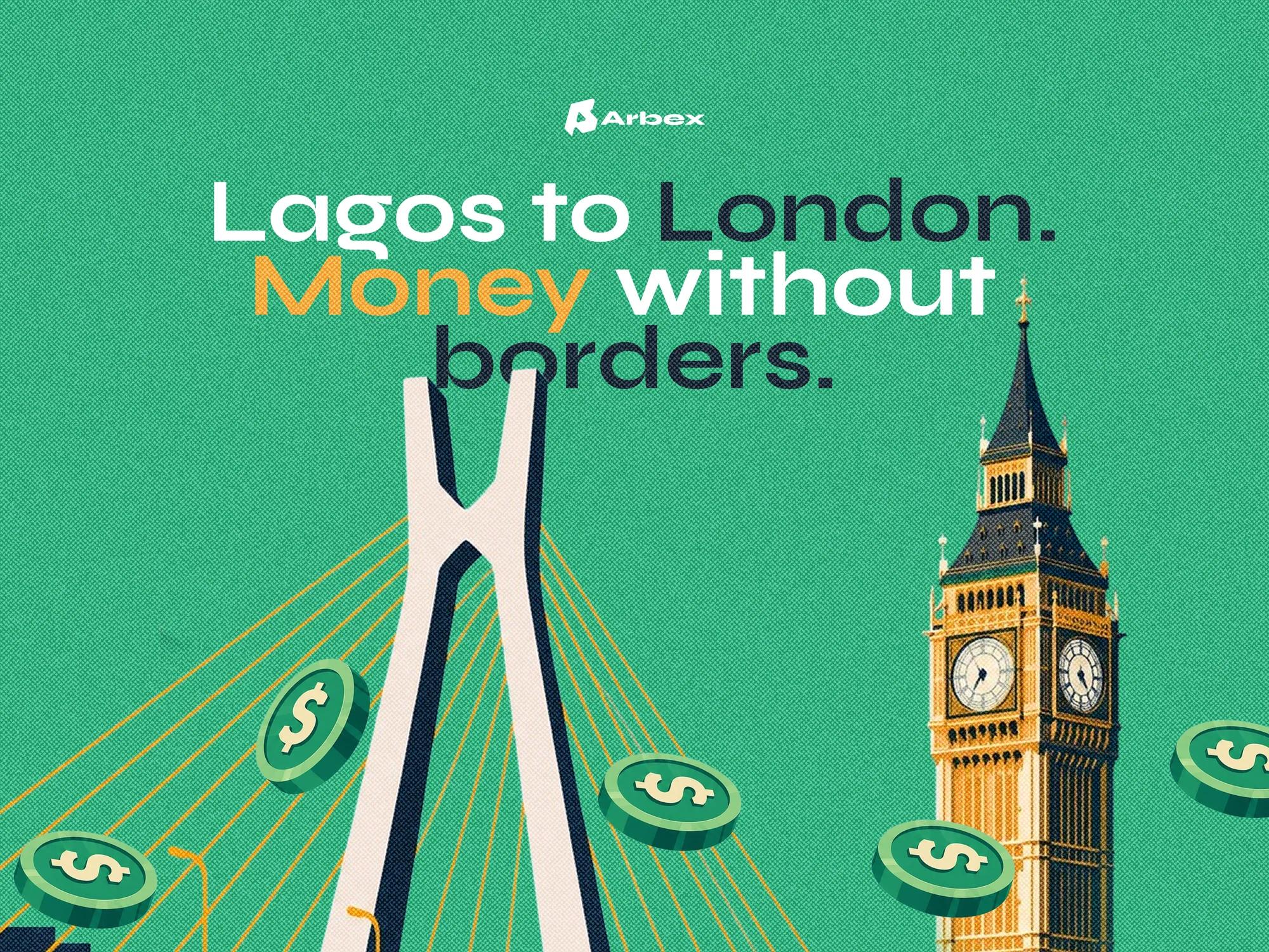
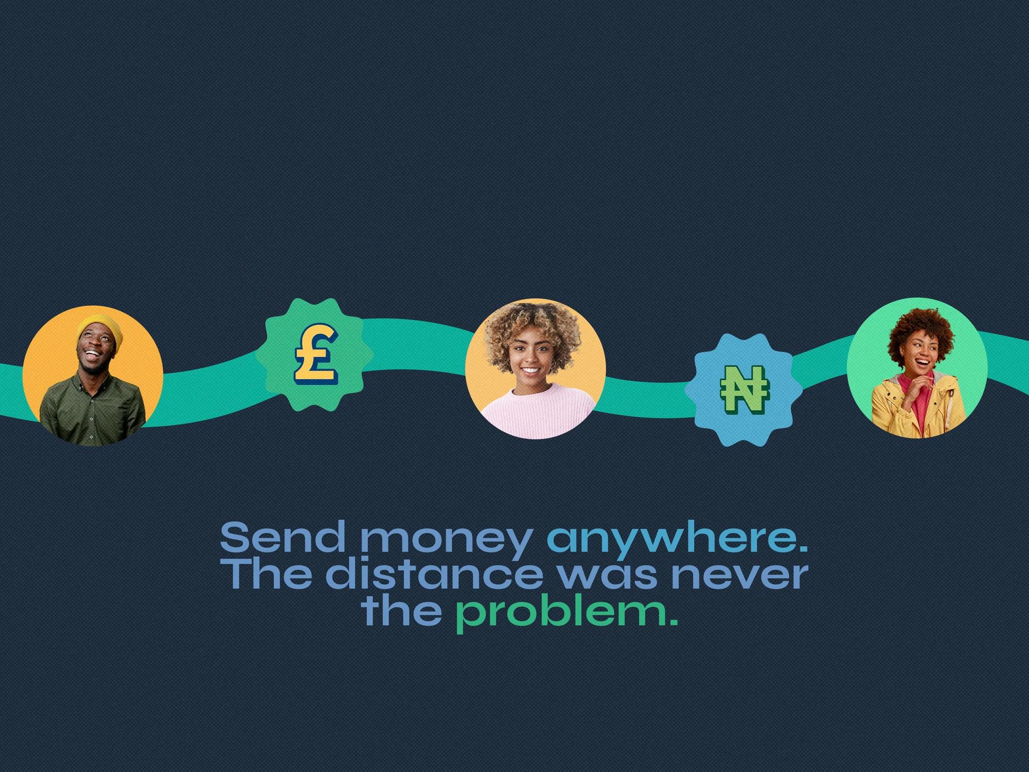
The positioning starts from a simple fact: the money was always here. The brand voice follows from it. Lines are short and declarative, such as "Money without borders" and "The distance was never the problem".
02
A mark built on movement
The symbol joins a paper plane and an arrow inside a shape that leans forward, so it reads as sending and as progress at once. Navy gives the palette weight, green leads, and orange adds warmth.
03
Illustration that shows the route
Transfers are shown as journeys between real places, Lagos to London, with landmarks and currency symbols. Portrait photography keeps the people sending and receiving at the centre.
04 / Identity system
The mark
A paper plane and an arrow, joined into one symbol.
Paper plane
Sending. Something leaves one person and reaches another, across any border.
Arrow
Progress. Forward movement, for the money and for the people it reaches.

Arbex
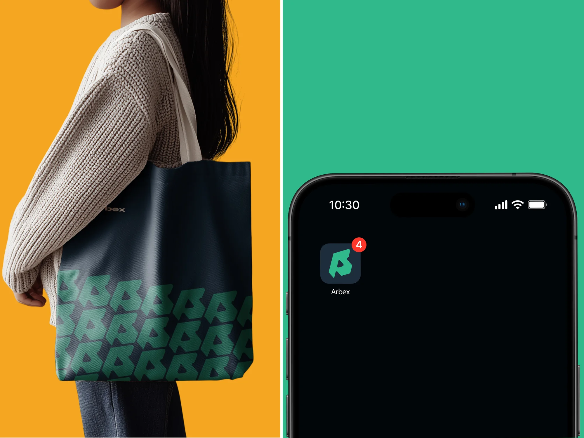
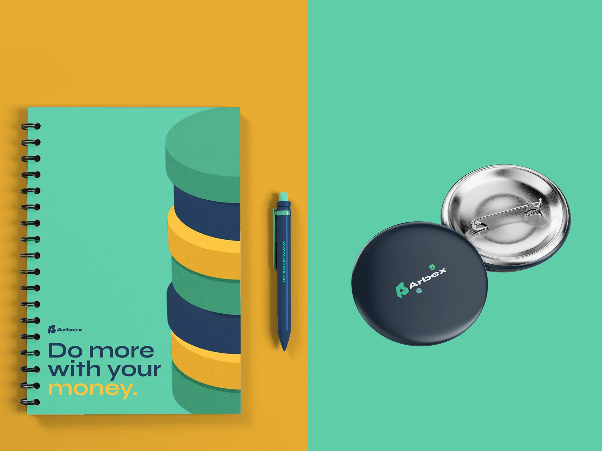
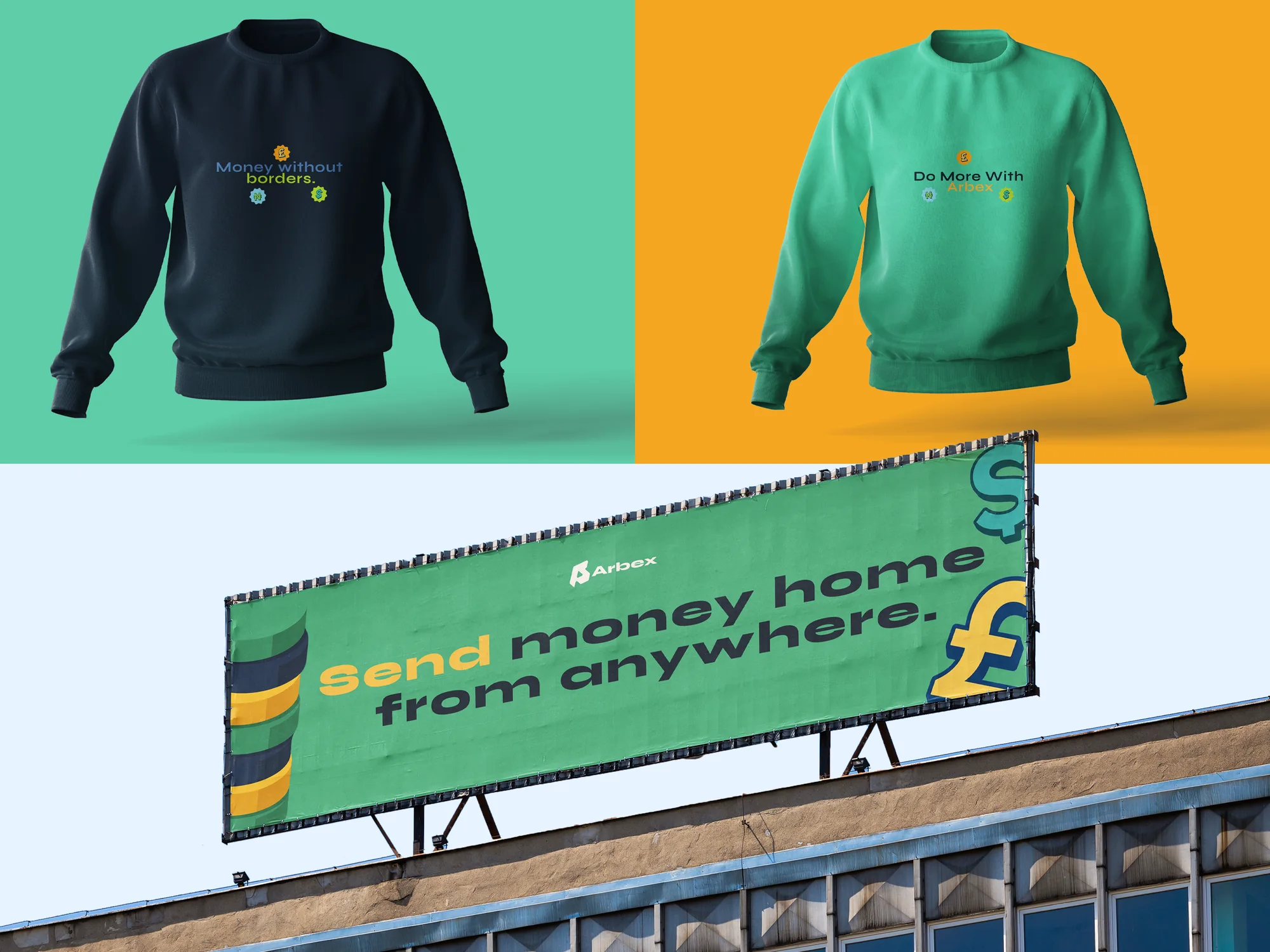
It stands alone as the app icon and repeats as a pattern across merchandise and print.
What it means
The plane sits inside the arrow, and the whole shape leans in the direction of travel. One symbol carries both ideas: money that crosses borders, and progress for the people on either side of it.
Colour, click to copy
Typeface
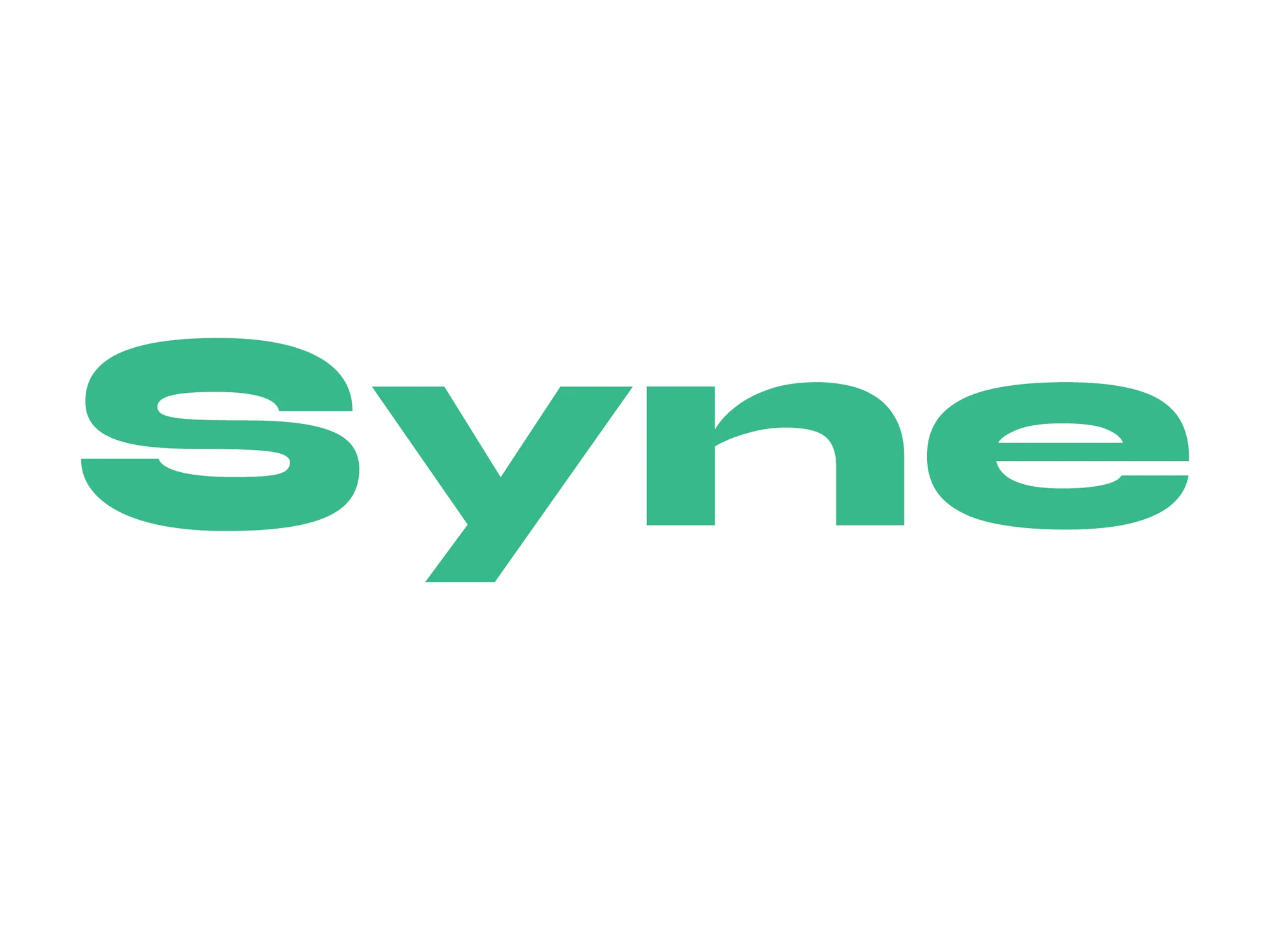
Syne
Syne combines bold geometric forms with distinctive character, giving the brand a modern, confident personality. It stays clean and legible across digital interfaces while reinforcing trust and professionalism.
05 / Applications


06 / Outcome
One mark, three colours, one typeface and one voice.
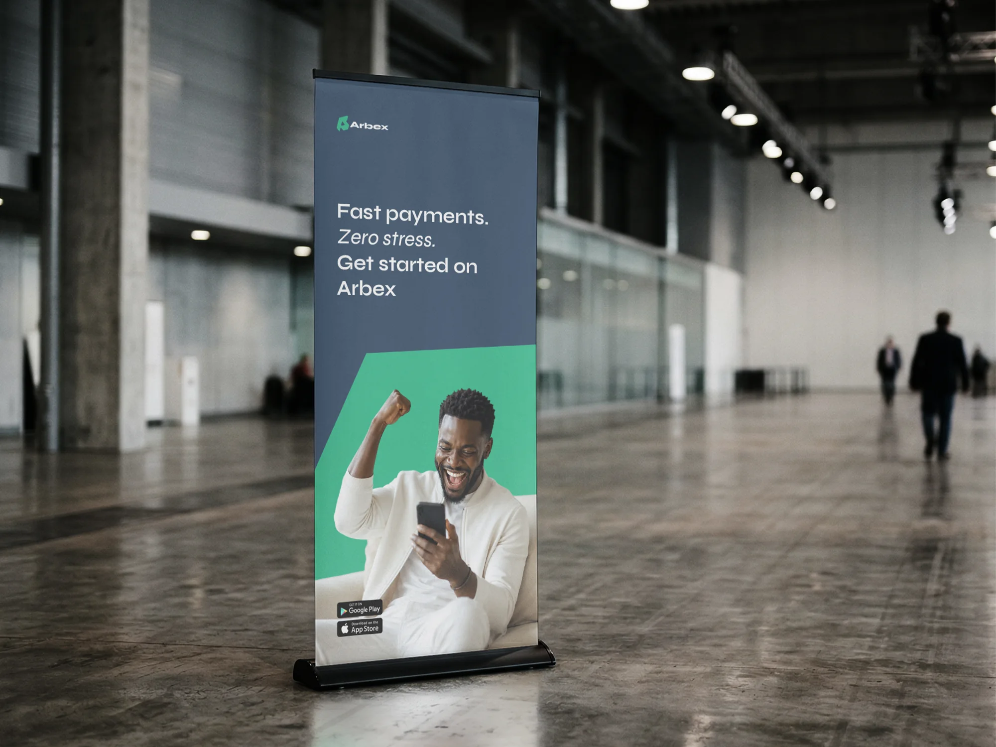
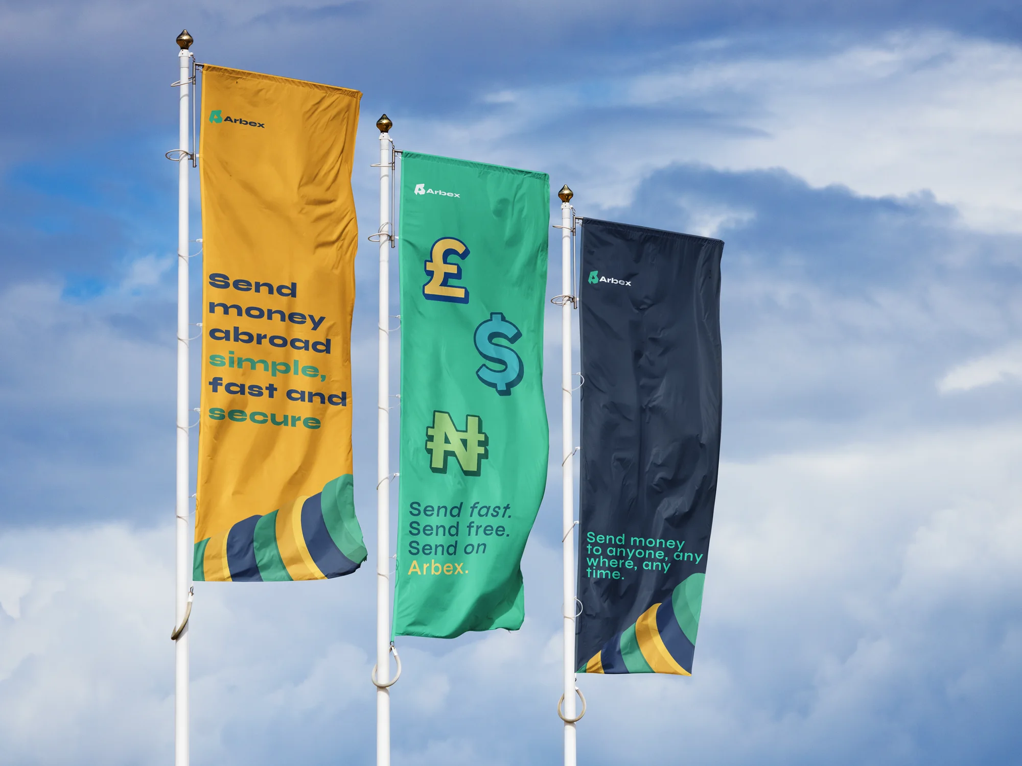
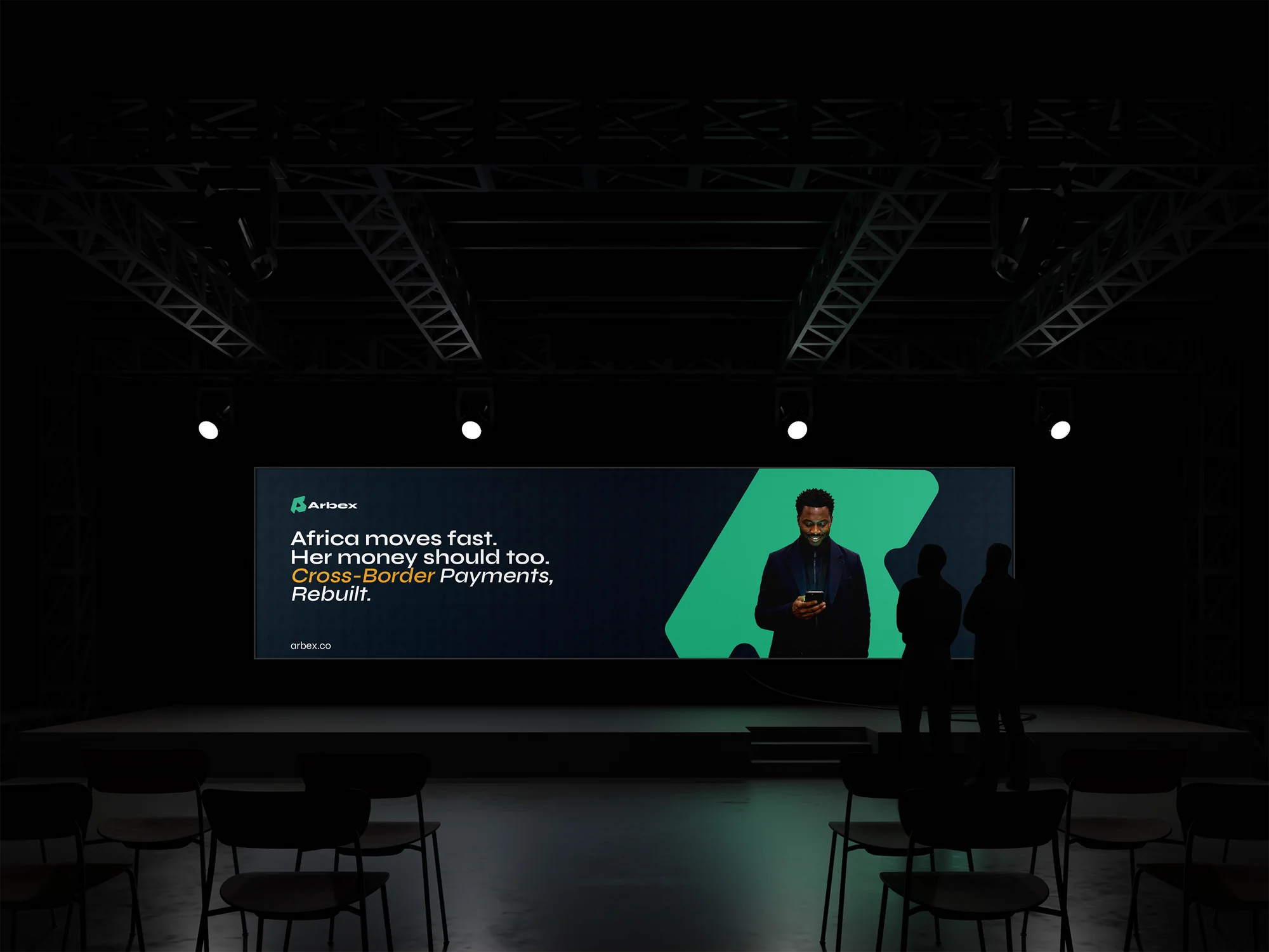
The identity stays consistent across every touchpoint it was designed for: the app icon, product notifications, stationery, merchandise, event screens and outdoor advertising.